8 Code nuggets for oil & gas data mining using Python SDK
Explore fuel oil supply levels, variable floating storage definitions, slowing 2020 journey times, and the likelihood of a vessel’s availability for spot chartering using Vortexa Python SDK.
This notebook briefly explores the types of analysis that can be done with Vortexa’s SDK.
We’ll create some useful helper functions, some interactive plots, and experiment with the latest data visualisation technology available. We’ll look into fuel oil supply levels, variable floating storage definitions, slowing 2020 journey times, and the likelihood of a vessel’s availability for spot chartering.
Let’s go!
1. Find product & geography children. Easy.
It can be useful to write helper methods that help navigate reference data. For example, let’s say we’re looking for all the product children of Fuel Oil.
2. Create an id <-> name dictionary. Easy.
It’s recommended to use IDs rather than names when programmatically referring to products, geographies, vessels, and corporations. Our unique identifiers (IDs) don’t ever change, whereas a name might: A vessel may change its name, for example.
However, we often want to replace IDs with names when generating human-readable output, hence an id-to-name dictionary comes in handy.
3. Plot floating storage levels split by product. Easy.
Floating storage is an important piece of the supply puzzle in seaborne energy product flows. Furthermore, analysing children grades of certain products might even help identify shifting market trends as they unfold within a product category.
Let’s see how fuel oil floating storage levels have varied over the last year. We can view the levels for both Fuel Oil’s children, High and Low Sulphur.
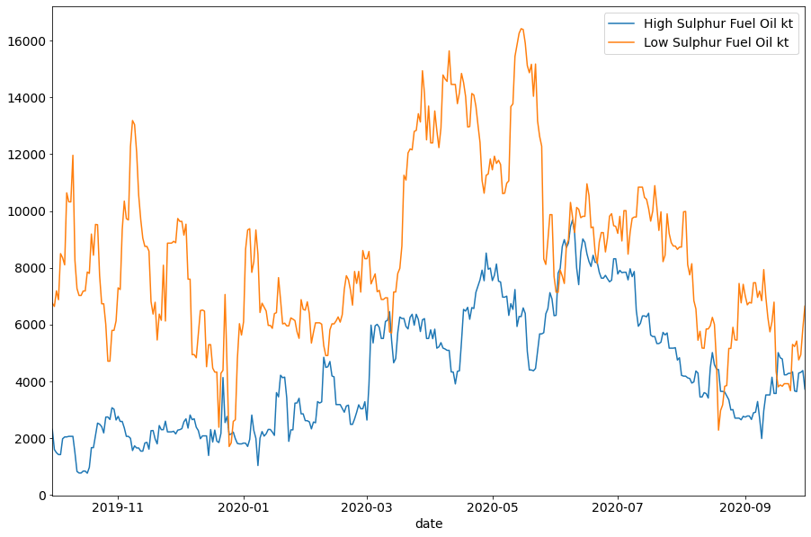
Here we see a sharp rise in LSFO floating storage coinciding with the drop in bunkering activity and wider oil demand in Q2. Meanwhile, HSFO floating storage volumes rose more steadily in the past 12 months – as HSFO bunker demand naturally fell post IMO 2020. It’s interesting to see HSFO floating storage fall post July, potentially linked to an increase in HSFO used as a refinery feedstock.
4. Interactive Custom Floating Storage Trends. Medium.
Here we use the CargoTimeSeries endpoint link and Jupyter Notebook’s interactive plotting features.
Let’s see how the total tonnage of Crude in floating storage has varied over the last year.
Floating storage methodology differs across companies, around the world. What if floating storage cargoes were only classified as floating storage because of port congestion like we saw in Chinese ports during Q3 particularly for crude?
The definition of floating storage is a fluid one; does a vessel standing stationary for 7 days count as floating storage, or is 14 days required? Thankfully, the SDK lets us specify the minimum days required for a cargo to be included in floating storage aggregates, and we’ll take advantage of that parameter here.
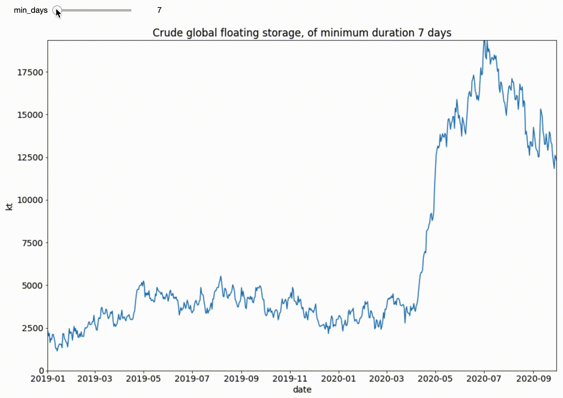
Being able to customise how you define floating storage can help navigate peculiar market situations.
5. Identifying the world’s busiest Clean Petroleum Ports. Medium.
Tracking energy flows allows us to truly understand supply & demand dynamics by identifying the countries and ports from which products are exported / imported.
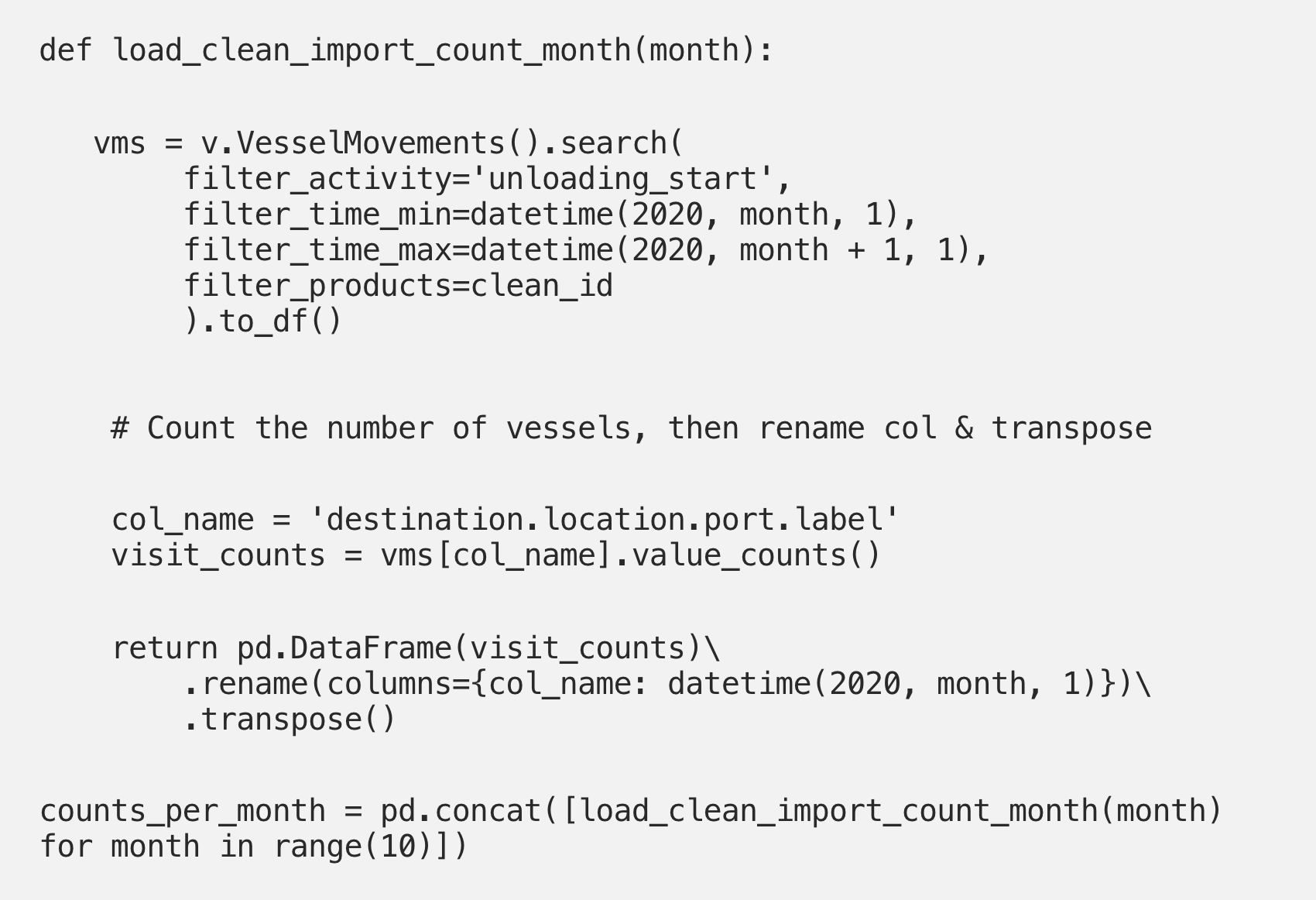
Let’s take a port-centric perspective here, and find the world’s busiest ports importing Clean Petroleum products. We’ll count the number of discharges per port per month, as a gauge of busyness.
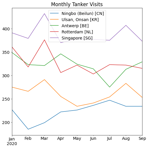
Information like this may be useful for charterers wondering which ports are more susceptible to congestion or delays. Alternatively, such data could also be interesting for companies looking at port infrastructure investments or assets liquidation.
6. Increasing voyage times of Jet heading from Asia to Europe. Medium.
Voyage duration is an important metric in seaborne energy markets specifically for freight market participants. Indications of increase or decrease in voyage times can indicate a range of factors from the strength of a market from a freight rate point-of-view or its lack of strength from a demand perspective.
We’ll analyst the journey times vessels carrying Jet from Asia to Europe, using the VesselMovements endpoint.
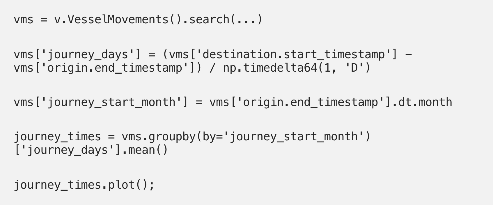
This is an interesting trade flow to analyse as tankers carrying jet fuel between these regions have the option to sail through the Suez Canal or to take the longer route around the Cape of Good Hope, depending on economic incentives to delay their discharge or arrival.
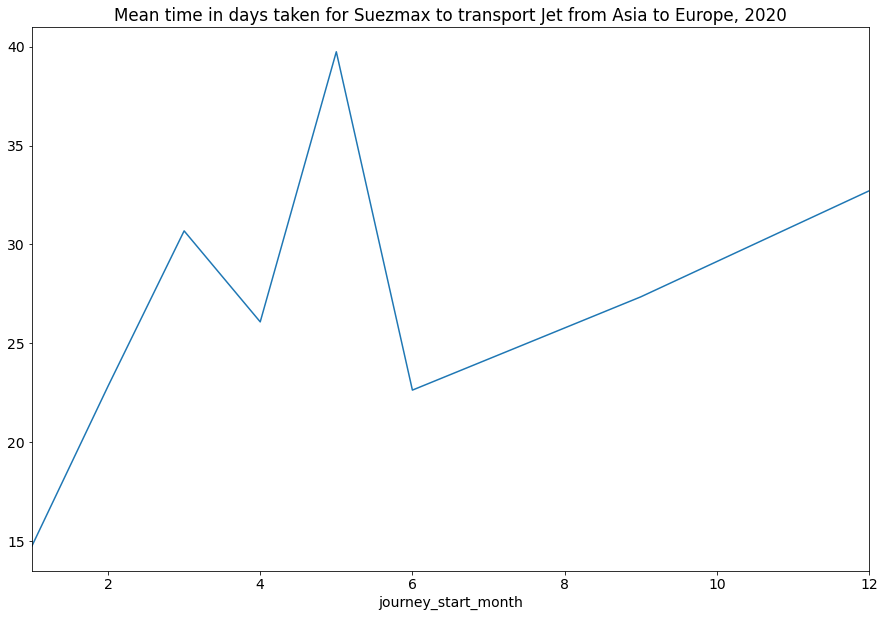
The spike in journey times coincides with when Jet fuel oversupply was most strained (Q2).
7. Which tankers take consistent routes, and which don’t? Medium-Hard.
Let’s see how varied an individual vessel’s routes are. For each vessel, we’ll calculate two things:
- The total number of journeys
- The total number of unique routes taken
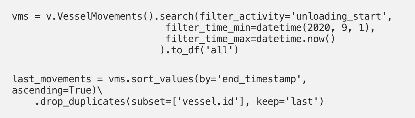
First, lets retrieve all vessel movements using the VesselMovements endpoint.
We’re only interested in a vessel’s IMO, and the movement origin & destination, so we’ll just keep these columns.
Now let’s create our route column, and count the total number number of routes a vessel has taken, and the total number of distinct routes.
Combining these in a scatter plot gives the following chart:
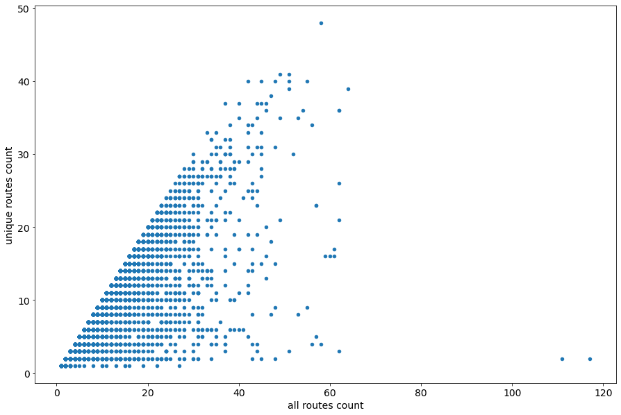
A vessel with many different routes is more likely to be available for spot chartering. Having better visibility of which tankers operate like this could have implications for charterers who may be concerned with how much variation there has been in the cargo carried in ship’s tanks.
8. Inspecting global positions of new and old tankers. Medium-Hard.
In the freight markets there’s a phenomenon known as the cascading effect. As tankers age, it becomes harder for them to obtain approvals for cargo loadings. These tankers then tend to transition to regions with less strict operational constraints, or they enter floating storage. Being able to analyse the age profile of a fleet based on its location can help visualise the whereabouts of these lenient regions.
Let’s use the KeplerGL visualisation tool to explore the relationship between vessel age and vessel location. We’ll see if we can identify areas of the world hosting predominantly older or newer tankers.
Once again, we use the VesselMovements endpoint to find the latest movement per vessel:
For each vessel movement, we can then calculate the vessel’s age like so:

We’re only interested in vessel age, and the lat/lon coordinates of the vessel’s last visited port, so we’ll create a dataframe containing only these columns.

Plotting this with KeplerGL Jupyter lets us immediately see areas of the world with both older (yellow) and younger (purple) tankers.
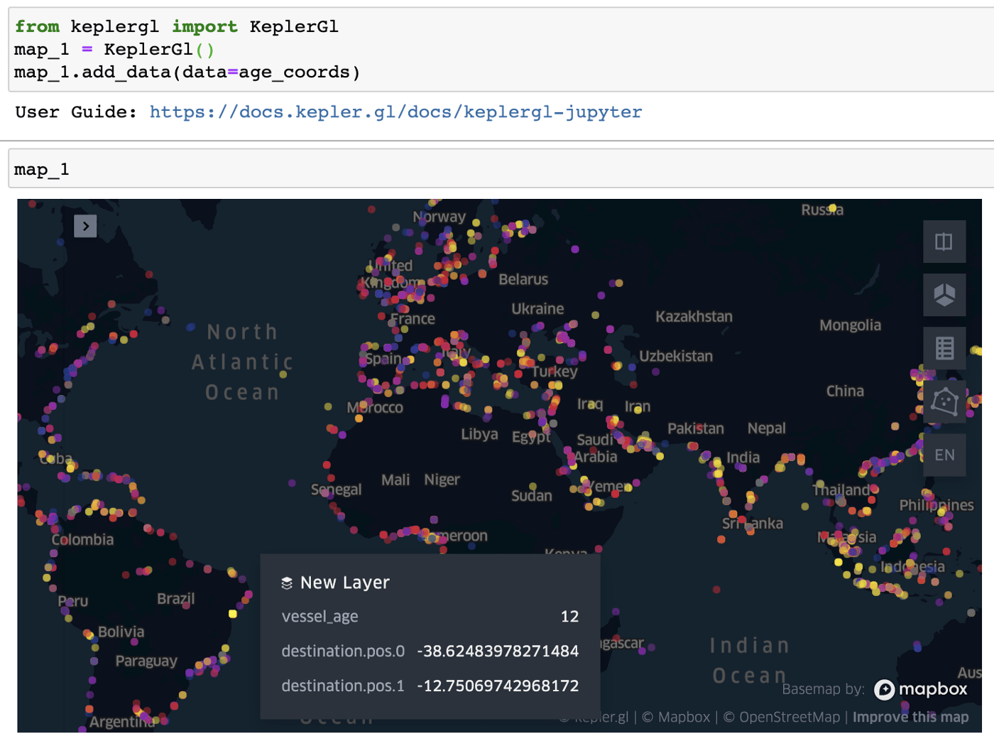
Tanker age shown on the colour spectrum. Yellow is older, purple is younger. Views like these can be particularly useful in insurance or compliance. Generally, older ships come with a higher operational risk. Knowing where those risks are higher/lower, across a given fleet can help a company understand how much more/less risk they need to take.


